How to Create a Memorable Logo That Builds a Strong Brand Identity
A great logo is often the first thing people notice about a business. Before customers read your website, browse your products, or interact with your team, they see your visual identity. That small symbol or wordmark has the power to communicate professionalism, personality, and trust within seconds. Whether you’re launching a startup, growing a small business, or building a personal brand, investing time in creating the right logo is one of the smartest decisions you can make.
If you’re looking for an easy way to design logos that reflect your brand’s personality, modern online tools make the process more accessible than ever. With customizable templates, intuitive editing features, and creative flexibility, even those without formal design experience can develop a professional-looking identity that stands out in today’s competitive marketplace.
Why Your Logo Matters More Than You Think
A logo is much more than a decorative graphic. It’s a visual representation of your brand’s values, mission, and promise to customers. Think about the companies you recognize instantly. Their logos trigger familiarity, confidence, and often an emotional connection.
For new businesses, a thoughtfully designed logo helps establish credibility from day one. Consumers naturally associate polished branding with professionalism. Even if your company is just getting started, a strong visual identity can make you appear more established and trustworthy.
For existing businesses, refreshing an outdated logo can signal growth, innovation, and a renewed commitment to serving customers. Sometimes a subtle redesign is all it takes to stay relevant while maintaining brand recognition.
The Building Blocks of an Effective Logo
Not every attractive logo is effective. The best logos balance creativity with simplicity while remaining functional across different platforms.
Here are several characteristics that successful logos tend to share:
Simplicity
Simple logos are easier to recognize and remember. Overly complex graphics can become difficult to reproduce and lose their impact when scaled down for social media profiles, business cards, or mobile screens.
Minimal doesn’t mean boring—it means focused.
Relevance
Every design choice should support your brand identity. Colors, typography, and icons should align with your audience and industry.
For example:
- A children’s education brand may use bright, playful colors.
- A financial consulting firm often benefits from clean lines and conservative tones.
- An outdoor adventure company may incorporate natural elements and earthy palettes.
Your logo should feel like an extension of your brand rather than just a stylish image.
Versatility
A modern logo needs to work everywhere.
It should look equally strong on:
- Websites
- Social media profiles
- Product packaging
- Email signatures
- Business cards
- Merchandise
- Presentations
Testing your logo in both large and small formats helps ensure it remains readable and recognizable.
Timelessness
Design trends come and go. While it’s tempting to follow the latest style, timeless logos tend to age better.
Ask yourself whether your logo will still represent your business well five or even ten years from now.
Choosing the Right Colors
Color psychology plays a surprisingly important role in branding.
Although there’s no universal rule, many industries use color strategically:
- Blue often communicates trust, professionalism, and reliability.
- Green suggests growth, health, and sustainability.
- Red conveys energy, excitement, and confidence.
- Black represents sophistication and luxury.
- Orange feels energetic, creative, and approachable.
Rather than choosing your favorite color, think about the emotional response you want customers to experience.
Consistency across all branding materials also strengthens recognition over time.
Typography Makes a Bigger Difference Than You Expect
Many memorable logos rely primarily on typography.
The right font communicates personality before anyone reads the words.
For example:
- Serif fonts often feel traditional and authoritative.
- Sans-serif fonts appear modern and clean.
- Script fonts can feel elegant or personal.
- Bold fonts create confidence and strength.
Avoid using too many font styles in a single logo. One carefully selected typeface usually creates a stronger visual impression than multiple competing styles.
Learning from Real Brands
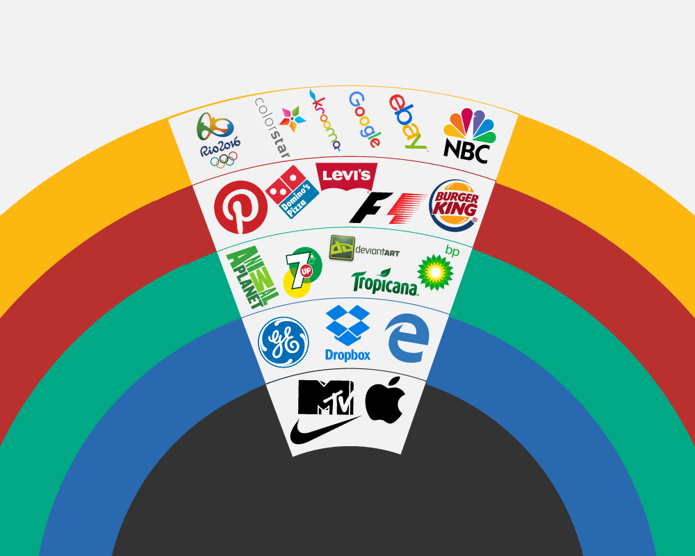
Some of the world’s most recognizable logos share common principles rather than elaborate designs.
Think about how easily you recognize simple symbols without needing accompanying text. Their success comes from years of consistent use combined with thoughtful design decisions that emphasize clarity and memorability.
Small businesses can apply these same principles without needing enormous marketing budgets.
A neighborhood coffee shop, freelance designer, online boutique, or local fitness coach all benefit from having a logo that’s easy to recognize and consistent across every customer touchpoint.
Common Logo Design Mistakes to Avoid
Many first-time business owners unintentionally create logos that become difficult to use later.
Some common mistakes include:
- Using too many colors.
- Including excessive detail.
- Following short-lived design trends.
- Choosing fonts that are difficult to read.
- Copying competitors too closely.
- Ignoring how the logo appears on mobile devices.
Taking time to review your logo in different sizes and backgrounds can help identify issues before launching your brand.
Practical Tips for Creating a Strong Logo
Whether you’re designing your first logo or updating an existing one, these strategies can improve the final result:
Start with Your Brand Story
Before opening any design software, write down three to five words that describe your business.
Examples might include:
- Friendly
- Innovative
- Reliable
- Premium
- Sustainable
These keywords provide valuable direction throughout the design process.
Sketch Multiple Ideas
Don’t settle for the first concept.
Professional designers often explore dozens of rough ideas before refining a final version.
Simple pencil sketches can uncover creative directions that software alone might not inspire.
Gather Feedback
Share your design with trusted colleagues, customers, or friends.
Ask questions like:
- What does this logo make you think of?
- Does it feel professional?
- Is it memorable?
- Would you recognize it again tomorrow?
Fresh perspectives often reveal strengths and weaknesses you may have overlooked.
Keep Improving
Brand identities evolve.
As your business grows, your logo can evolve too. Small refinements over time often produce stronger long-term branding than dramatic redesigns every few years.
Your Logo Is Just the Beginning
A logo creates recognition, but your overall brand experience builds loyalty.
Consistent colors, photography, messaging, customer service, website design, and product quality all reinforce the impression your logo creates.
When every element works together, customers begin associating your visual identity with positive experiences, making your brand easier to remember and recommend.
Final Thoughts
Creating a memorable logo isn’t about chasing trends or making the most elaborate design possible. It’s about communicating who you are in a way that’s clear, authentic, and instantly recognizable. By focusing on simplicity, consistency, and your brand’s unique personality, you can build a visual identity that supports long-term growth and leaves a lasting impression on your audience. A thoughtfully crafted logo becomes more than just an image—it becomes the face of your business and a valuable asset that grows stronger with every customer interaction.