Why Most Roofing Contractor Websites Fail at Turning Visitors Into Customers (And How Better UI Fixes It)
Roofing is one of the most competitive local service industries online. A homeowner with a leaking roof doesn’t browse, they panic-search roof repair near me, open three or four sites, and call whichever one feels trustworthy and easy to deal with within about 15 seconds. That’s not an exaggeration. Attention spans on emergency home-service searches are brutally short.
And yet, walk through almost any roofing company’s website and you’ll find the same problems repeated over and over: cluttered navigation, buried phone numbers, contact forms with twelve fields, stock photos of generic houses, and zero indication of what actually happens after someone submits an inquiry. These aren’t small cosmetic issues, they’re conversion killers. A roofer can rank #1 on Google and still lose the job simply because the website made it hard to take the next step.
This is fundamentally a UI/UX problem, not a marketing problem. And it’s one that’s solvable with the right design decisions.
The First 5 Seconds Decide Everything
When someone lands on a roofing site, they’re subconsciously asking three questions almost instantly:
- Do these people actually do roofing (and do they do it near me)?
- Do they look legitimate?
- How do I reach them right now?
If the hero section doesn’t answer all three, visitors bounce. That means your above-the-fold layout needs a clear service statement, a visible service area, a trust signal (licensing, years in business, reviews), and a call-to-action that isn’t hidden in a hamburger menu. Sticky headers with a click-to-call button and a visible “Get a Free Estimate” button aren’t a luxury for roofing sites; they’re the baseline.
Forms Are Where Leads Go to Die
This is the single biggest, most fixable mistake in home-service web design. A long, multi-field form feels like homework to someone standing in their attic with a flashlight looking at water damage. Every additional field reduces completion rate.
Good roofing sites use progressive forms: start with just “What’s the issue?” and a phone number, then optionally expand. Better yet, pair the form with a scheduling widget so the visitor can pick a time instead of waiting for a callback removing the biggest source of lead-conversion anxiety, which is not knowing if or when someone will respond.
If your goal as a contractor is to genuinely get more roofing leads, the fix usually isn’t more traffic, it’s removing friction from the moment someone is already on your site and ready to act. GlassHousePro’s guide on generating roofing leads goes deeper into the funnel-level strategies (paid ads, SEO, review generation) that feed this same principle from the traffic side, which pairs well with fixing the on-site experience described here.
Visual Proof Beats Copywriting
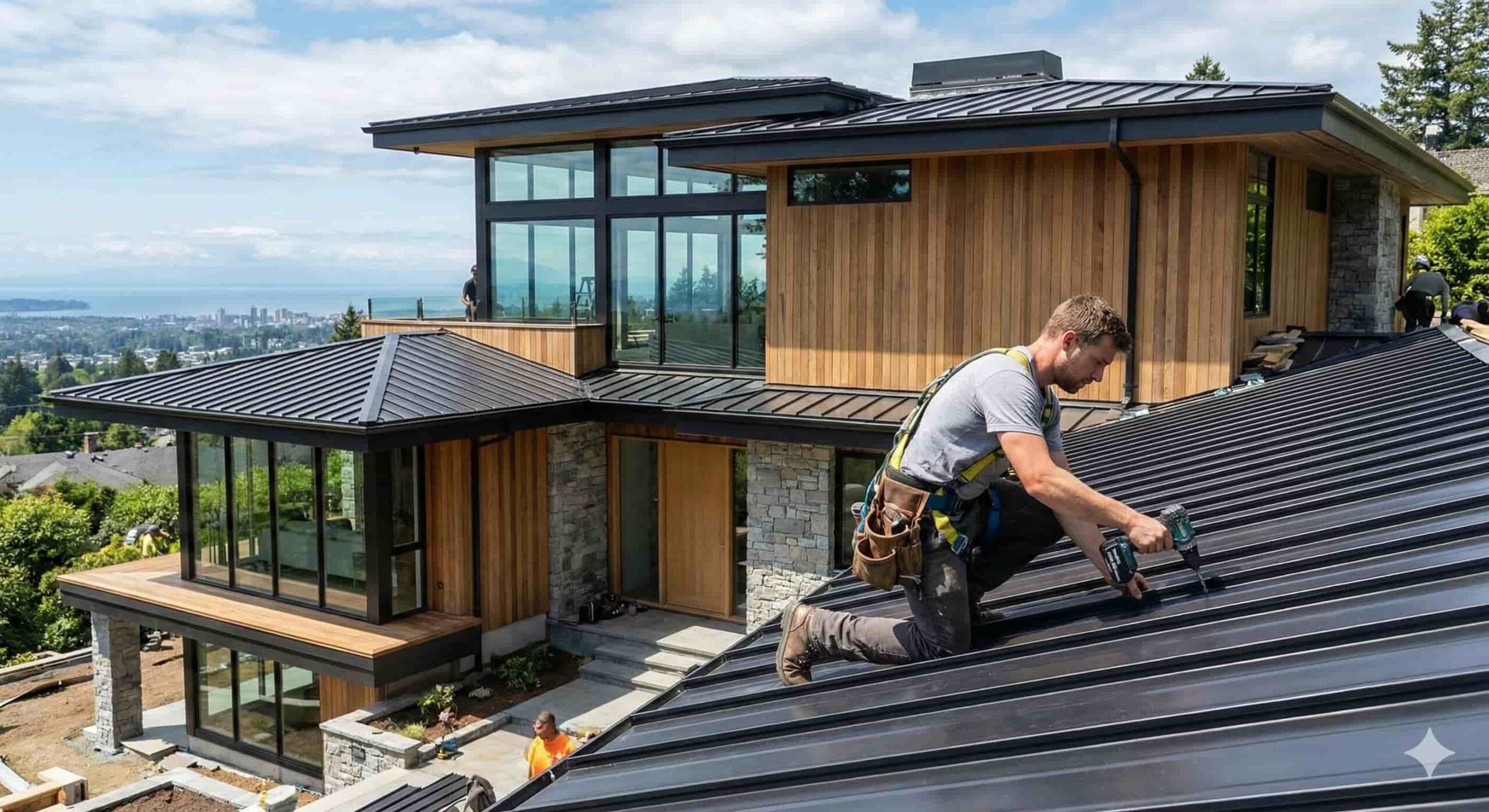
Roofing is inherently visual. homeowners want to see the damage, the material, and the finished result before they trust a stranger on their roof. Yet most contractor sites lean on paragraphs of sales copy instead of photos. A well-structured before/after gallery, organized by roof type or material, does more conversion work than any headline could. Component-based layouts (card grids, lightboxes, filterable galleries) make this easy to implement without a custom build which is exactly where a solid UI framework earns its keep.
Mobile Isn’t Secondary, It’s Primary
The majority of “emergency roof repair” searches happen on a phone, often outdoors, often in bad weather, often on a slow connection. If a site’s tap targets are too small, if the form zooms awkwardly, or if the click-to-call button isn’t within thumb’s reach, the contractor has already lost that visitor to a competitor with a cleaner mobile layout. Design mobile-first for this niche, not as an afterthought.
Trust Signals Need to Be Structural, Not Decorative
Reviews, licensing badges, insurance info, and warranty details shouldn’t be crammed into a footer nobody scrolls to. They need to be woven into the layout at decision points right next to the estimate form, right after the service description, right before the CTA. Trust isn’t a page; it’s a pattern that repeats at every moment the visitor is deciding whether to commit.
The Takeaway
A roofing company’s website is often the deciding factor between two contractors with nearly identical qualifications. The one with a faster, clearer, more mobile-friendly, lower-friction site wins the call regardless of who has better reviews on paper. For designers and developers building in this space, that means treating layout, form design, and component structure as lead-generation tools in their own right, not just aesthetic choices.
Good UI doesn’t just make a roofing site look professional. It’s what actually gets the phone to ring.