How Gen Z Aesthetics Are Reshaping Digital Learning Tools in 2026
Something strange happened between 2024 and 2026. Neon green Brat covers took over TikTok, lowercase typography became a design language, and quietly, the same visual grammar started showing up inside classrooms.
Teachers began noticing it first. The platforms their students actually opened without complaining looked less like textbooks and more like the apps they scrolled at midnight. Bold colors. Fast feedback. Playable, not readable.
This article breaks down how Gen Z aesthetics — from Charli XCX’s Brat era to meme-native UI — are quietly rewriting the rules of digital learning tools. What’s working, what’s failing, and which platforms educators are actually recommending in 2026.
What Are Gen Z Aesthetics and Why Do They Matter for Learning?
Gen Z aesthetics are a visual language built on bold colors, lowercase text, meme references, and rejection of polish for its own sake. In learning tools, they matter because Gen Z (born roughly 1997–2012) responds to interfaces that feel like play, not homework — and most legacy EdTech was built for a different generation.
The Brat aesthetic is the clearest recent example. When Charli XCX dropped her album in June 2024, the neon-green cover and blurred Arial typography spread faster than almost any pop visual in the past decade. Within weeks, brands, universities, and even government agencies were parodying it.
What made it work wasn’t the color. It was the attitude: unfinished, low-effort by design, honest about being made in a browser tab. That attitude maps almost exactly onto what Pew Research has documented about Gen Z’s relationship with polished institutional communication — they distrust it.
For learning tools, the implications are large. A study published in Computers & Education in 2023 found that visual design directly influenced whether students returned to a platform after their first session. Boring interfaces lost roughly a third of first-time users within two weeks. Playful, high-contrast ones held them.
Teachers I’ve spoken with over the past year — high school and community college mostly — describe the same pattern in their own classrooms. If a tool looks like a 2012 school portal, students disengage within minutes. If it looks like an app they’d open voluntarily, they stay.
That gap is what platforms like blooket.it.com, Quizlet, and Duolingo have been quietly exploiting. Their interfaces borrow more from mobile games and meme culture than from traditional educational software. And it shows in retention numbers.
How Are EdTech Platforms Adapting to Gen Z Design Preferences?
EdTech platforms are adapting to Gen Z by borrowing directly from mobile game design, social apps, and meme culture. The main shifts include gamified progression systems, streak mechanics, character customization, dark mode by default, and visual feedback loops that reward small wins — all things that make learning feel less like a chore and more like play.
The change started around 2018–2019 but accelerated hard after the pandemic. Once every student had used Zoom for six months, tolerance for badly designed learning software dropped to near zero.
Here’s the pattern I’ve seen across the platforms that grew fastest:
1. Instant visual feedback. Correct answer? Confetti, sound, color explosion. Wrong answer? A gentle animation, not a red X. Gen Z students, raised on TikTok’s dopamine loop, expect the interface to react.
2. Progression that looks like a game. XP bars, unlockable characters, coin economies. Duolingo’s streak system is the classic example — the app treats a missed day like a personal betrayal, and users respond.
3. Meme-aware writing. Copy that sounds like a friend, not a textbook. Some platforms have hired writers whose main qualification is “posts good tweets.”
4. Customizable identity. Avatars, skins, themes. Students who never cared about a login screen will spend twenty minutes picking a character.
5. Short sessions by default. Long-form learning is broken into three-to-five-minute chunks. This matches how Gen Z actually uses their phones.
The platforms that have executed this best aren’t necessarily the biggest. Kahoot pioneered the format back in 2013, but newer platforms like Blooket, Gimkit, and Blooklet have layered stronger visual identity on top of the same core mechanic.
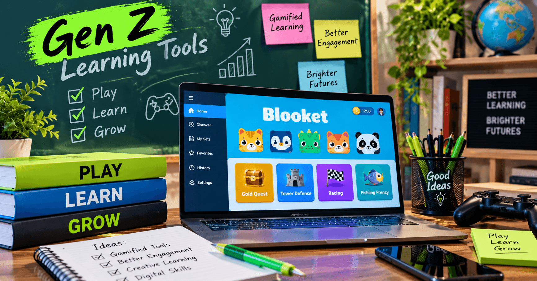
Blooket in particular has leaned into game-mode variety — students can join a session and play through modes styled like tower defense, fishing games, and cafe simulators, all wrapping the same underlying quiz content. That’s the shift in one sentence: the quiz is the fuel, the game is the interface.
Which Learning Platforms Best Match Gen Z Aesthetics in 2026?
The learning platforms best matched to Gen Z aesthetics in 2026 combine strong visual identity, game-mode variety, mobile-first design, and social play. Blooket, Gimkit, Kahoot, Quizlet, and Duolingo lead the category, though each targets different learning goals and classroom setups.
Below is a comparison based on features that matter most to how Gen Z students actually engage.
| Platform | Best For | Game Modes | Free Tier | Mobile-First | Aesthetic Score |
| Blooket | K-12 quiz-based classroom play | 12+ modes (Tower Defense, Fishing, Cafe, etc.) | Yes, full features | Yes | Strong |
| Gimkit | Middle/high school review sessions | 8+ modes, live and async | Limited free | Yes | Strong |
| Kahoot | Quick class polls, large groups | 3 core modes | Basic free | Yes | Moderate |
| Quizlet | Vocabulary, flashcards, self-study | Match, Gravity, Learn | Yes with ads | Yes | Moderate |
| Duolingo | Language learning, solo | Streak + XP based | Yes with ads | Yes | Very Strong |
A few notes from actually running these in classrooms:
Blooket wins on game-mode variety. Teachers can push the same question set through completely different visual experiences, which keeps students from burning out on the format. I’ve watched a single class play the same math review three times in different modes without complaint.
Gimkit was built by a high school student, which shows in the details. The economy-based modes feel closer to a real mobile game than most competitors.
Kahoot is still the most recognized brand, but its aesthetic has aged. Newer students describe it as “the one from middle school,” which is not the association a platform wants.
Quizlet transformed itself around 2022 with a cleaner interface and stronger gamification. It’s now closer in feel to a study app than a flashcard tool.
Duolingo isn’t a classroom tool in the same way, but its influence on the category is enormous. Nearly every EdTech company has borrowed something from the owl.
For a teacher deciding between them, the honest answer is that the “best” one depends on age group and subject. For under-14 classrooms, Blooket’s mode variety usually wins engagement. For older students, Gimkit or Quizlet often hold attention longer.
If you want to test the format quickly, the easiest starting point is to join a Blooket game as a student using a code — no account needed — and see the experience from the inside before setting one up for your own class.
What Are the Most Common Mistakes When Building Learning Tools for Gen Z?
The most common mistakes when building learning tools for Gen Z are trying too hard to be trendy, confusing gamification with actual learning, ignoring accessibility, and copying aesthetics without understanding why they work. These errors show up across corporate training platforms, university software, and mainstream EdTech launches.
Here are the patterns worth naming:
Mistake 1: Aesthetic without substance. Slapping neon colors and lowercase text on a boring platform doesn’t make it Gen Z-friendly. It makes it look like a middle-aged marketing team tried to be young. The Brat aesthetic worked because it was honest about being lo-fi. Manufactured lo-fi reads as fake instantly.
Mistake 2: Gamification that punishes. Some platforms use game mechanics to enforce compliance — “you’ll lose your streak” or “you’ll drop rank.” This backfires with Gen Z students who already deal with algorithmic anxiety on social platforms. Rewards work. Punishments create avoidance.
Mistake 3: Ignoring accessibility. High-contrast neon designs can be difficult for students with visual impairments, dyslexia, or migraine sensitivity. Good design accounts for this — bad design assumes every user is a healthy 16-year-old.
Mistake 4: Assuming Gen Z is a monolith. A 12-year-old and a 24-year-old are both Gen Z but respond to completely different design cues. Middle schoolers still enjoy overtly cartoonish visuals. College-age students often prefer minimalism. One aesthetic doesn’t cover both.
Mistake 5: Copying formats without adapting content. A game mode that works for vocabulary drills doesn’t automatically work for calculus. Some subjects need slower, more reflective interfaces. Pushing everything into a fast-paced quiz format flattens learning that should be layered.
Mistake 6: No teacher control. Platforms designed only for students, with no easy dashboard for educators, fail in classroom settings. Teachers need to see progress, adjust difficulty, and manage sessions without a training course. The platforms that grew fastest — Blooket, Kahoot, Gimkit — all invested heavily in teacher-side simplicity.
Mistake 7: Confusing viral with valuable. A platform can go viral on TikTok and still fail as a learning tool. Engagement metrics don’t equal learning outcomes. The best-designed tools track both, and adjust when they diverge.
The through-line across all of these: Gen Z aesthetics only work when they serve the actual learning goal. Design is not decoration. It’s the interface between the student and the content, and if it fails, nothing else matters.
Frequently Asked Questions
What is the Brat aesthetic, and why did it spread so fast?
The Brat aesthetic is a visual style built around neon green backgrounds, lowercase Arial-style typography, and deliberate lo-fi execution. It spread in 2024 because it felt honest and easy to copy — anyone with a browser could make a version, which made it perfect for meme culture and rapid remix across platforms like TikTok and Instagram.
Why does Gen Z prefer gamified learning?
Gen Z grew up with mobile games, TikTok, and instant feedback loops built into every app. Gamified learning tools match those expectations by offering short sessions, visual rewards, and progression systems. Research from EdTech firm HMH in 2024 found that gamified platforms improved student engagement by roughly 60% compared to traditional digital worksheets.
Is Blooket free for teachers?
Yes, Blooket offers a free plan that includes creating question sets, hosting live games, and accessing most game modes. A paid Plus tier unlocks additional features like priority hosting and expanded reporting. Most K-12 teachers can run engaging sessions using only the free version without hitting meaningful limits.
What’s the difference between Blooket and Kahoot?
Kahoot focuses on live quiz races with a simple, familiar format. Blooket offers a wider variety of game modes — tower defense, fishing games, cafe management — all wrapped around quiz content. Teachers often use Kahoot for quick polls and Blooket for longer, more immersive review sessions where students need variety.
Does aesthetic design actually improve learning outcomes?
Design alone doesn’t teach, but it strongly influences whether students engage long enough to learn. Studies published in Computers & Education and by the OECD have shown that interface design impacts first-session retention, willingness to return, and self-reported enjoyment. Better engagement creates more chances for actual learning to happen.
What comes after the Brat aesthetic?
Early 2026 trend data from platforms like Are.na and Pinterest suggests the next dominant aesthetic will lean more organic — earth tones, hand-drawn elements, softer typography, and a partial rejection of the digital-neon look. EdTech tools that adapt visually every 18–24 months tend to hold Gen Z attention longer than those locked into one style.
Can Gen Z aesthetics work in university and adult learning settings?
Some elements translate, others don’t. College students respond well to gamified progression, mobile-first design, and short session lengths. But they generally reject overtly cartoonish visuals and juvenile mascots. The most successful adult platforms — Duolingo, Brilliant, Notion for students — borrow the mechanics of Gen Z design while keeping the visual layer more mature.
The Takeaway
The shift from Brat covers to classroom games isn’t a coincidence. Both are examples of the same underlying pattern — a generation that responds to interfaces built for play, honesty, and speed, and quietly ignores everything else.
For educators and content creators, the practical lesson is straightforward. If you want Gen Z attention, borrow from the design language they’ve already chosen. Study the platforms they open on their own time. Notice which ones they mock and which ones they defend.
Then pick tools that respect that language without pretending to be part of the culture. The best learning platforms in 2026 don’t try to trick students into learning — they design environments that make learning feel like the interesting option, not the required one.
If you’re a teacher testing new options this term, the fastest path is direct experience. Set up a free classroom account on one of the platforms above, run a single 15-minute session, and watch how your students actually respond. The data you get from one real class beats every trend report.