Making Brat-Style Promo Graphics for Your Small Online Shop
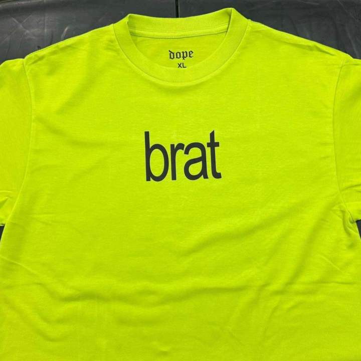
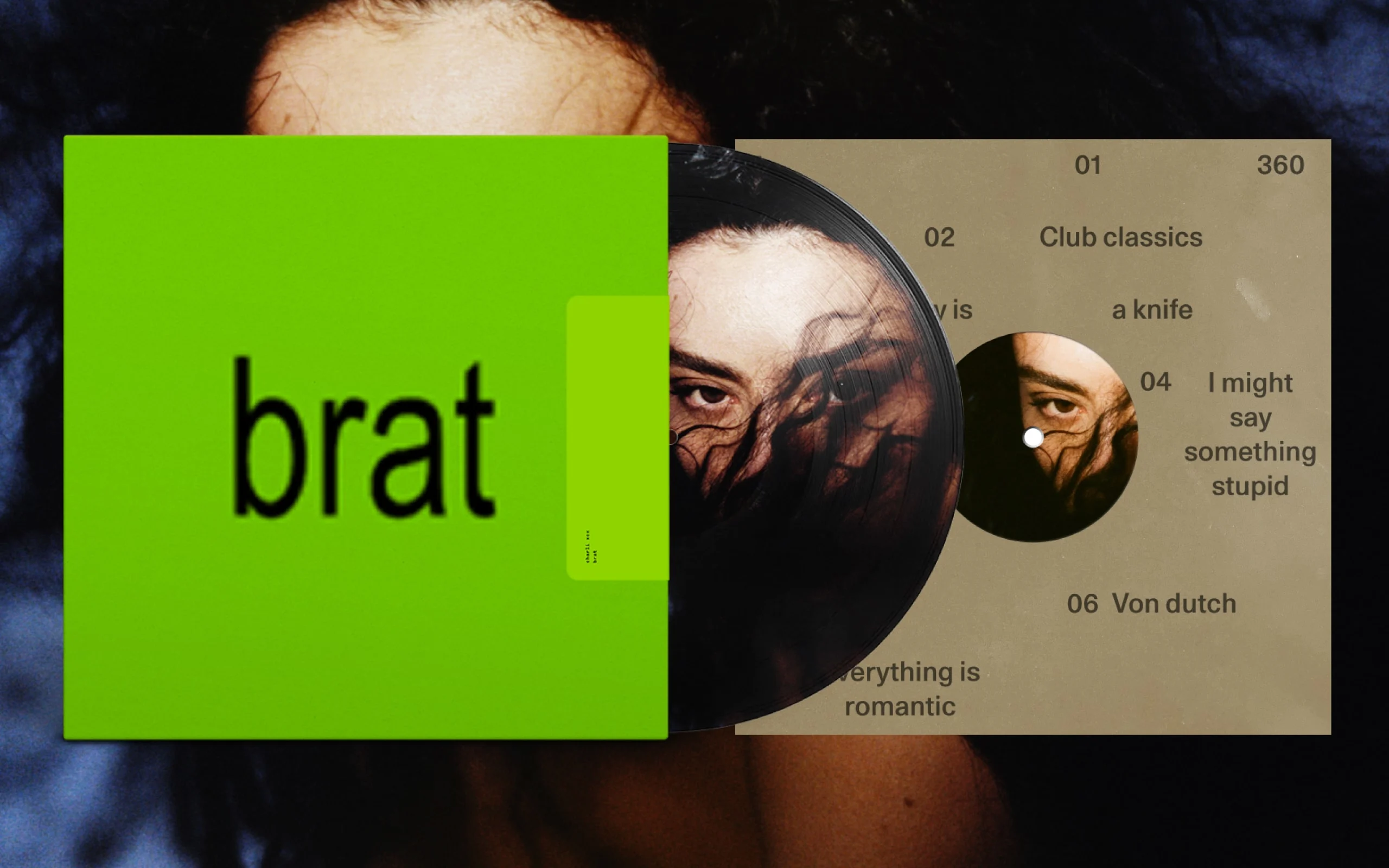
The lime-green, lowercase, blurred-text look from Charli XCX’s Brat era didn’t stay confined to album covers for long. Small sellers picked it up fast because it’s instantly recognizable, easy to produce, and stands out in a feed full of polished, over-designed promo graphics. If you’re running a small shop and want a promo post that actually gets stopped-scrolled-on, the Brat aesthetic is one of the easiest trends to borrow without needing design skills.
Why the Brat Look Works for Small Sellers
Most promo graphics try too hard — gradients, stock photo backgrounds, five different fonts fighting for attention. The Brat aesthetic does the opposite: a flat color background, one lowercase word or phrase, minimal design. That simplicity is exactly why it reads as confident rather than cheap, and why it takes minutes to make instead of hours.
A few reasons it fits small shop marketing specifically:
- It’s fast to produce, which matters when you’re running promos frequently and don’t have time for elaborate design work.
- It reads clearly at thumbnail size, unlike busier designs that lose detail when compressed into a feed grid.
- It feels current, borrowing recognition from a trend shoppers already associate with something fresh rather than generic.
How to Make One in a Few Minutes
Step 1: Pick your background color. The signature lime-green is the most recognizable, but any single flat color works if it matches your brand better.
Step 2: Keep the text to one short phrase, lowercase. “new drop,” “restock,” “last few left” — short and blunt reads better than a full sentence.
Step 3: Use a slightly blurred, low-contrast font effect if your tool supports it. This is the small detail that signals “Brat-style” rather than just “green background with text.”
Step 4: Avoid adding a logo or extra elements. Part of the aesthetic’s appeal is restraint — resist the urge to fill empty space.
Step 5: Export at the right size for the platform you’re posting to. A square crop works for feed posts, while a taller crop suits Stories better.
Pairing the Graphic With a Clear Offer
A striking graphic gets attention, but it still needs to lead somewhere specific. Vague promo posts (“check out my shop!”) convert worse than ones that name an exact product, price, or deadline. Once someone clicks through interested in an item, the next thing they usually want to know is what shipping will actually cost — and a seller who can answer that instantly, instead of “message me for shipping,” tends to close the sale faster.
If you’re shipping within Malaysia, having the numbers ready before a customer asks makes a real difference. Running the estimate through the Poslaju rate calculator ahead of time lets you post an accurate shipping estimate directly in the caption or reply instantly when someone asks, instead of leaving them waiting and possibly moving on to another seller.
Common Mistakes When Using Trend-Based Graphics
- Posting the graphic without any real offer behind it. A striking design with nothing specific to click through to wastes the attention it earns.
- Overusing the same look every single post. The aesthetic loses impact fast if every post looks identical — save it for actual announcements, not routine updates.
- Ignoring accessibility. Low-contrast text looks great as a design choice but can be genuinely hard to read for some viewers; keep at least one high-contrast version if the caption carries essential info like a price or date.
- Forgetting to update old promo graphics. A “last few left” graphic still circulating in Stories highlights days after the stock actually sold out looks careless.
Keeping the Momentum After the Post Goes Up
Reply to comments quickly while the post is fresh. Trend-driven graphics often get an initial burst of engagement that fades fast — quick replies keep that window open longer.
Repost to Stories with a countdown sticker if there’s a deadline. This adds urgency without needing a second design.
Track which promo graphics actually convert, not just which get likes. A high-engagement post that doesn’t lead to sales is worth noting so you can adjust the offer, not just the design, next time.
FAQs
Do I need design software to make a Brat-style graphic? No — most free online design tools can produce the flat-color, lowercase-text look in a few minutes without any prior design experience.
Does the Brat aesthetic work for every type of product? It works best for short, punchy announcements like drops, restocks, or limited-time offers rather than detailed product descriptions.
How do I avoid the trend feeling overused on my page? Save it for genuine announcements instead of every single post, so it keeps standing out against your regular content.
Should I include shipping cost in the promo post itself? Including an accurate estimate upfront tends to reduce back-and-forth messages and speeds up the decision for interested buyers.
How do I calculate shipping cost before posting a promo? Running the package details through a courier’s rate calculator ahead of time gives you a number to post confidently instead of guessing.
Final Thoughts
A bold, minimal graphic gets the scroll to stop, but it’s the details after that — a clear offer, an accurate shipping estimate, a quick reply — that actually turn attention into a sale. Borrow the aesthetic, but don’t let the design carry the whole promo on its own.