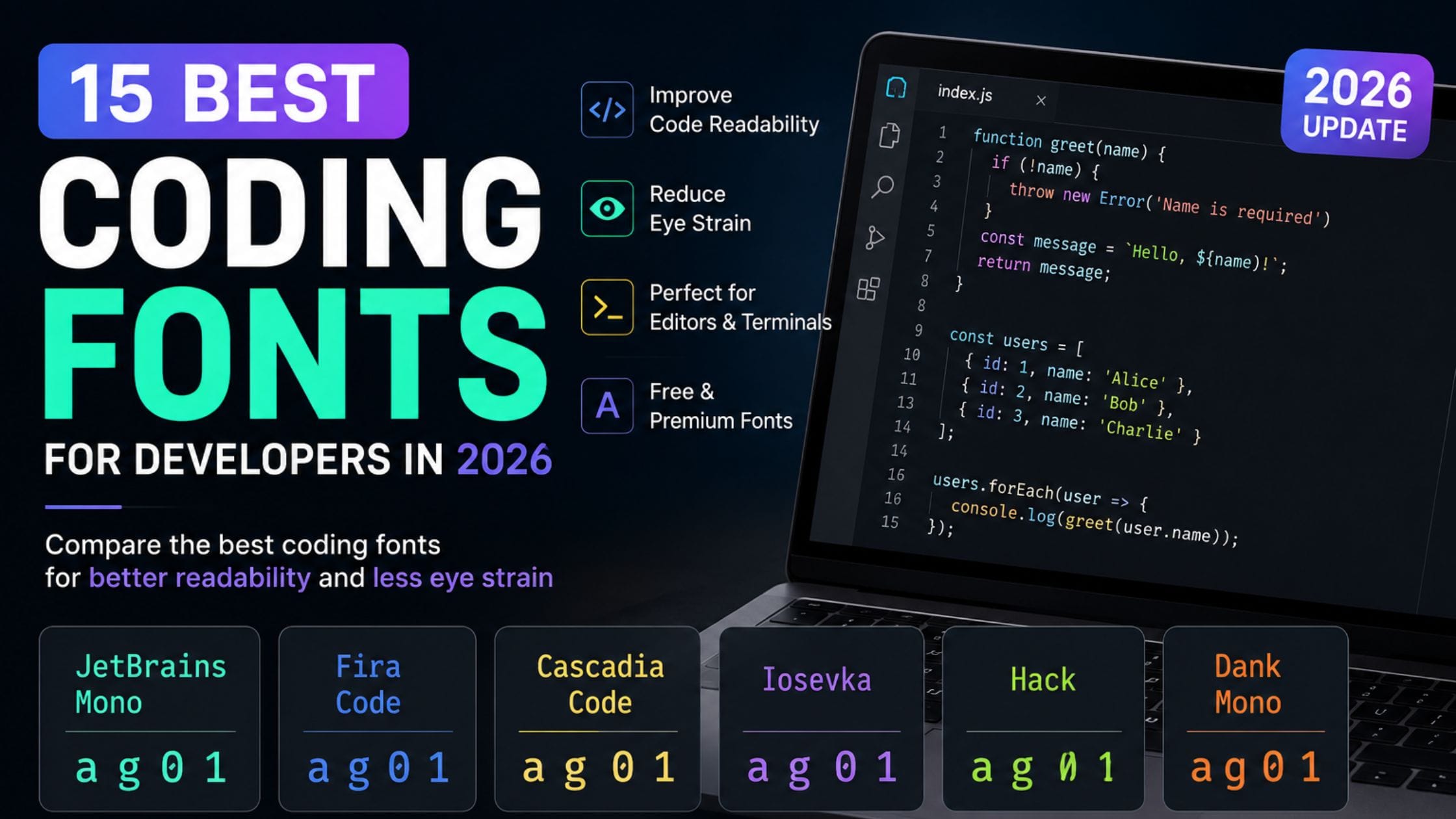
15 Best Coding Fonts for Developers in 2026 (Free and Paid)
Most developers spend hours every day staring at the same font without ever choosing it on purpose. The default editor font ships with the IDE, nobody changes it and small readability problems pile up over a long session. Blurry zeros, cramped punctuation and letters that look almost identical all slow you down in ways you rarely notice until you switch to something better. This guide breaks down the best coding fonts for 2026, what actually makes a font good for reading code and how to pick one that fits your editor, your terminal and your eyes.
Table of Contents
What Makes a Font Good for Coding
A coding font is a monospaced typeface built to keep every character the same width so columns of code line up correctly. Regular text fonts like Arial or Times New Roman are proportional, meaning an “i” takes up less space than a “w,” which breaks indentation and makes nested code hard to scan. Programming fonts fix this by giving every letter, number and symbol the exact same horizontal space.
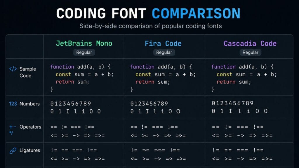
Beyond spacing, a strong coding font needs to separate characters that regular fonts often blur together. The number zero and the capital letter O, the lowercase L, the capital I and the number one are the classic trouble spots. A well-designed coding font gives the zero a dot or a slash, gives the one a distinct flag and keeps the L and I visually different even at 13 or 14 pixels.
Ligatures are another factor worth understanding before you pick a coding font. A ligature merges a symbol combination like => or != into a single connected glyph on screen, while the underlying characters in your file stay completely unchanged. Some developers find ligatures speed up scanning. Others find them distracting or even misleading, especially in code reviews where the raw characters matter more than how they render. Every font in this guide either supports ligatures as an optional toggle or skips them by design, so you can decide for yourself.
How We Picked These Fonts
This list focuses on fonts that are actually in wide use across VS Code, JetBrains IDEs and terminal emulators today, not niche experiments. Each font here was evaluated against four practical tests: how well it separates similar characters, how it holds up during long reading sessions, whether it renders cleanly across Windows, macOS and Linux and how easy it is to license or install for personal and commercial projects. Free and open source options make up most of the list because that is what most developers actually reach for but a few paid fonts are included where the price genuinely buys something extra.
Quick Comparison Table
| Font | Best For | Ligatures | Price | Platforms |
| JetBrains Mono | All-around daily use | Optional | Free | Windows, macOS, Linux |
| Fira Code | Ligature-heavy workflows | Yes, extensive | Free | Windows, macOS, Linux |
| Cascadia Code | Windows Terminal and VS Code | Optional | Free | Windows, macOS, Linux |
| Hack | Plain, distraction-free code | No | Free | Windows, macOS, Linux |
| Iosevka | Narrow, space-saving layouts | Optional | Free | Windows, macOS, Linux |
| Source Code Pro | Beginners, simple setups | No | Free | Windows, macOS, Linux |
| Berkeley Mono | Polished, premium feel | Optional | Paid | Windows, macOS, Linux |
| Dank Mono | Cursive italics for web dev | Yes | Paid | Windows, macOS, Linux |
| Monaspace | Variable weight and texture | Yes | Free | Windows, macOS, Linux |
| Geist Mono | Clean, minimal branding style | No | Free | Windows, macOS, Linux |
JetBrains Mono: Best All-Around Coding Font
JetBrains Mono is the safest default recommendation for most developers heading into 2026 and it comes bundled with every JetBrains IDE including IntelliJ IDEA, WebStorm and PyCharm. According to JetBrains’ own font page, the typeface keeps letter width standard while increasing the height of lowercase letters, which helps each character occupy more pixels and improves rendering at small sizes. The JetBrains font team also explains that the zero carries a visible dot to separate it from the capital O, a detail that matters more than it sounds during a long debugging session.
The font ships with 138 code-specific ligatures that can be turned on or off in your editor settings, plus support for well over a hundred languages. It comes in eight weights from Thin to ExtraBold, so you can match it to dark mode, light mode or a presentation screen without switching fonts entirely. Because it is free, open source under the Apache 2.0 license and already installed if you use a JetBrains product, it is the easiest coding font on this list to try today.
Fira Code: Best for Ligature Fans
Fira Code popularized programming ligatures years ago and remains one of the most widely used coding fonts in 2026. It transforms common symbol pairs such as !=, => and <= into single connected glyphs while keeping the actual characters in your file exactly the same. Web developers working heavily in JavaScript and TypeScript tend to gravitate toward Fira Code because arrow functions and comparison operators read noticeably faster once merged.
The tradeoff is that ligatures are polarizing by nature. Some teams disable them entirely during code review so nobody misreads a merged symbol and Fira Code makes that easy since ligatures toggle with one setting. If you have never tried a ligature font before, Fira Code is the most common starting point and the one most tutorials assume you are using.
Cascadia Code and Hack: Best for Terminal Users
Cascadia Code was built by Microsoft for Windows Terminal and ships as the default font in many modern terminal setups. It offers crisp, evenly spaced characters that stay readable at small sizes, along with an optional ligature mode similar to Fira Code. Because it was designed with terminal density in mind, it tends to feel comfortable in server environments, SSH sessions and log files where you are scanning a lot of plain text quickly.
Hack takes a more stripped-down approach and skips ligatures completely. Every character is unambiguous and every symbol renders exactly as typed, which appeals to developers who want zero visual interpretation between what they wrote and what they see. It is a strong pick for systems programming, shell scripting and any workflow where character-for-character accuracy matters more than visual flair.
Iosevka: Best Compact and Minimalist Option
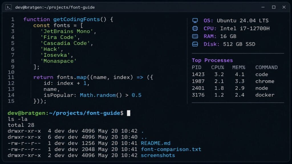
Iosevka takes a narrower approach than most coding fonts on this list, packing more characters per line without making anything harder to read. That narrow profile matters if you work with a lot of horizontal space, run multiple editor panes side by side or simply prefer a sleeker look on a smaller screen. The font is highly configurable too, with a build tool that lets you customize weight, slant and even letter shapes if you want to fine-tune your own variant.
Because Iosevka trades a little bit of visual breathing room for extra horizontal density, it suits developers with strong reading habits more than complete beginners. If you already know you like a tighter layout, it is worth testing for a full week before switching back.
Berkeley Mono and Dank Mono: Best Paid Fonts
Not every good coding font is free, and both Berkeley Mono and Dank Mono justify their price for developers who want something with a more polished, custom-designed feel. Berkeley Mono leans into precise geometry and consistent spacing across every weight, and many developers describe it as the closest thing to a designed coding font rather than a purely functional one. It works well for anyone who spends time recording screencasts, taking documentation screenshots or presenting code to a live audience.
Dank Mono takes a different angle by including genuinely cursive italics alongside its regular characters, which stands out in comments and string literals without hurting the monospaced grid. Web developers who want their JSX or template literals to visually pop from the surrounding logic often pick Dank Mono specifically for that italic treatment. Both fonts require a one-time purchase, so test the free trial or preview images closely before buying either one.
Monaspace: Best New Variable Font
Monaspace is the newest entry on this list and represents where coding fonts are heading in 2026. It ships as a family of five styles that share identical letter widths, so you can mix a monospaced sans-serif for code with a script-style variant for comments without breaking column alignment anywhere in the file. The family also includes a texture healing feature that adjusts spacing dynamically to reduce the visual noise that ligatures and bold text usually introduce.
Because Monaspace is free and open source, it is worth testing even if you are happy with your current font. The variable weight system in particular gives you more flexibility than older monospaced fonts, since you can shift emphasis for headers, comments or diffs without swapping the whole family.
How to Install and Switch Your Coding Font
Switching your coding font takes a few minutes on any major editor, and the process is nearly identical across platforms.
1. Download the font files from the official source, such as GitHub or the type designer’s website, rather than a random font aggregator.
2. Install the font system-wide. On Windows, right-click each font file and choose Install. On macOS, double-click the file and click Install Font. On Linux, drop the files into ~/.local/share/fonts and run fc-cache -f.
3. Open your editor’s font settings. In VS Code, go to Settings and search for Font Family, then type the exact font name.
4. Enable ligatures if you want them. In VS Code this is a separate Font Ligatures checkbox. In JetBrains IDEs, go to Editor, then Font, and check the ligatures box there.
5. Test it for at least a few days before deciding. Font preference is personal, and a few hours is rarely enough to judge readability fairly.
How to Pick the Best Coding Font for Your Setup
There is no single best coding font for every developer, but a few simple rules narrow the choice quickly. Beginners who want a safe, no-surprises option should start with Source Code Pro or JetBrains Mono, since neither has confusing ligatures or an unusual letter shape to adjust to. Professionals doing full-time development work benefit most from JetBrains Mono or Fira Code, both of which balance readability with enough personality to stay pleasant across an eight-hour day.
Terminal-heavy users should lean toward Cascadia Code or Hack, since both were built with dense, fast-moving text in mind. Anyone who wants a tighter, more compact layout should try Iosevka before assuming a smaller font size is the answer. If budget is not a concern and you want a font that feels genuinely custom, Berkeley Mono or Dank Mono are worth the purchase.
Whatever you pick, always test it inside your actual editor at your actual font size rather than judging from a preview image online. A font that looks great at 24 pixels in a marketing screenshot can look completely different at the 13 or 14 pixels most developers code at daily.
If you also style text outside your editor, for social posts, thumbnails or bios, the Brat Generator homepage covers a completely different kind of text styling built for creators rather than developers. For font choices specifically aimed at memes and social captions rather than code, the meme font guide on this blog is a closer match.
FAQs
What is the best coding font for beginners?
Source Code Pro is the safest starting point for beginners because it has no ligatures and no unusual letter shapes to learn. JetBrains Mono is a close second and works well once you are ready for a font with a bit more visual character. Both are free and install in a few minutes on any major operating system.
Do coding fonts actually reduce eye strain?
A well-designed coding font reduces eye strain indirectly by making characters easier to tell apart, which means less mental effort spent decoding text. Features like increased x-height, clear zero and O separation and consistent spacing all contribute to fewer misreads over a long session. The effect is subtle day to day but noticeable after months of comparison.
Should I use ligatures in my coding font?
Ligatures come down to personal preference rather than a universal best practice. Some developers find that merged symbols like => and != scan faster and make functional code more readable. Others prefer to see every character exactly as typed, especially during code review and choose a font like Hack that skips ligatures entirely.
Is JetBrains Mono only for JetBrains IDEs?
JetBrains Mono is free and open source, so it works in VS Code, Sublime Text, Vim, terminal emulators and any other editor that lets you set a custom font. It ships bundled with JetBrains products for convenience but nothing about the license restricts it to that ecosystem.
What is the difference between a monospace and a proportional font for coding?
A monospace font gives every character the same width, which keeps indentation and column alignment consistent across a file. A proportional font like Arial or Calibri varies character width based on the letter, which breaks vertical alignment and makes nested code harder to scan. Every font on this list is monospaced for that reason.
Are paid coding fonts worth the money?
Paid coding fonts like Berkeley Mono or Dank Mono are worth it if you want a more distinctive look for screen recordings, documentation or presentations or if you simply prefer their specific letterforms. For most day-to-day development work, free options like JetBrains Mono or Fira Code cover the same core readability needs at no cost.
Conclusion
The best coding font is the one that disappears into the background while you work, catching your attention only when something in the code genuinely deserves it. JetBrains Mono remains the easiest all-around recommendation for 2026, Fira Code stays the top pick for anyone who likes ligatures and newer options like Monaspace show where variable-width design is heading next. Try two or three fonts from this list in your actual editor this week, give each one a real multi-day test and keep whichever one your eyes stop noticing.
If this guide helped you clean up your development setup, share it with a teammate who is still coding in the default editor font or drop a comment with the font you ended up switching to.