Color, Light and Restraint: What Gives an Image a Coherent Aesthetic
An aesthetic image has more than attractive colors or a fashionable filter. Its elements feel as though they belong together. The palette supports the mood, the composition gives the eye somewhere to go, and the texture feels appropriate to the subject. Even a simple picture can have a strong aesthetic when those decisions are coherent.
That is why choosing an AI image tool is only part of the process. The tool needs to give you a useful way to express and revise a direction, but you still need to know what that direction is. A long list of style words can produce an elaborate image without producing a clear visual identity. An AI art generator can provide quick studies of those relationships, but style labels alone are a poor brief. Asking for pale morning light on worn ceramic tells you more than asking for an aesthetic image. Judge the study by the visual decisions it reveals, even if you eventually draw or photograph the final piece yourself.
Begin with a small set of visual decisions you can explain: perhaps a low-contrast palette, side lighting and only one textured surface. Then look for conflicts between those decisions. A glossy object may interrupt a soft, muted scene even when it is attractive on its own.
Define the feeling in visual terms
Start with a mood, then translate it into observable choices. Calm might mean soft contrast, a limited palette and generous empty space. Restlessness might involve a tilted composition, crowded shapes or a sharp contrast between light and dark. The mood becomes useful when you can explain how the image should create it.
Choose a small number of qualities that work together. A scene described as minimalist, ornate, quiet, energetic, nostalgic and futuristic may contain more contradictions than direction. Some contrasts can be intentional, but they should have a purpose you can articulate.
Write a one-sentence creative intention. For example, “a quiet, slightly nostalgic image of everyday objects in warm late-afternoon light.” This gives you a baseline. If a result looks technically impressive but feels loud and glossy, you can identify why it does not fit without dismissing it as simply wrong.
Look for control over composition
A useful image workflow lets you communicate where attention should go. The subject’s size, placement and relationship to empty space shape the image before any decorative style is applied. A beautiful palette cannot fully rescue a composition with no clear focal point.
Test the tool with a simple subject and a specific arrangement. Ask for one main object near a window, a small supporting element and an uncluttered area on one side. Compare whether the result respects those relationships or fills the frame with unnecessary detail.
Use thumbnail review. Reduce the image and see whether its broad structure still works. If everything merges into a busy patch, simplify the scene. A strong aesthetic often survives reduction because it is built on clear shapes and deliberate contrast rather than on fine detail alone.
Treat color as a system
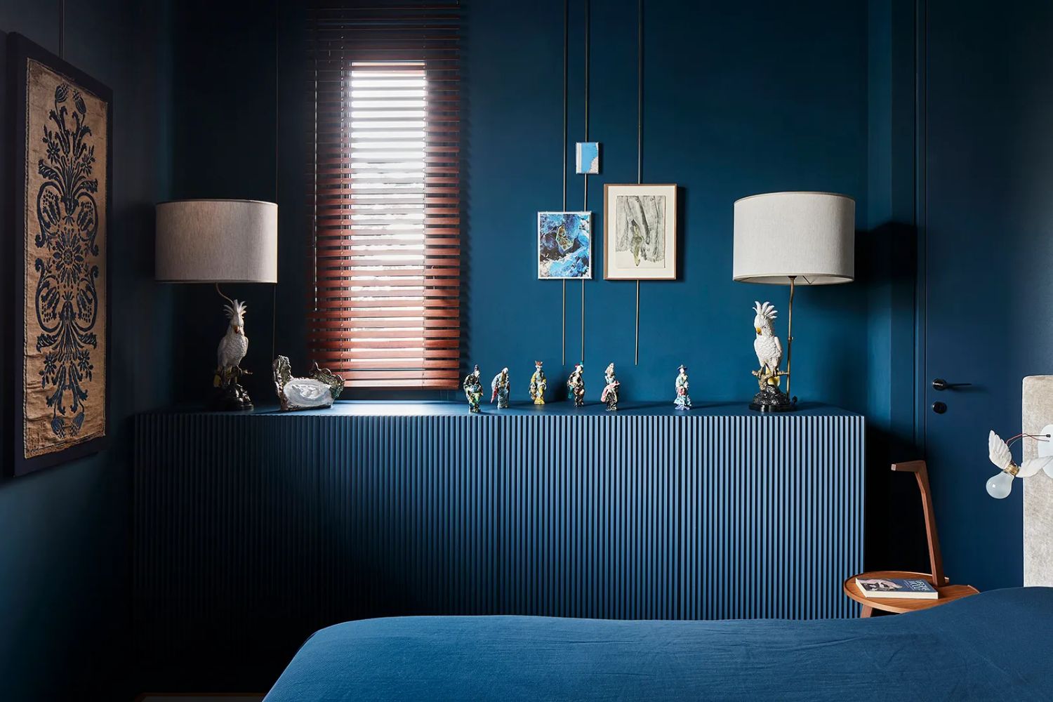
Choose a palette with a reason. One color can establish the atmosphere, a second can support it and a small accent can direct attention. This does not mean every image needs exactly three colors, but a limited starting palette makes the relationships easier to control.
For a soft nostalgic still life, you might explore cream, muted brown and a restrained blue accent. For a sharper graphic image, you might use a neutral background with one saturated color. Describe the relationship, not only the color names. “Mostly warm neutrals with a small cool accent” communicates a hierarchy.
Check whether the palette remains coherent after editing or cropping. A small accent can become dominant in a tight crop. A background color may influence how the main subject is perceived. Evaluate the image as a whole rather than deciding that each individual color is attractive on its own.
Use light to establish atmosphere
Light determines how surfaces feel and how the scene is read. Soft side light can reveal texture without making the image harsh. Backlighting can emphasize an outline. Hard directional light can create graphic shapes and a stronger sense of tension.
Describe lighting in relation to the subject. Instead of asking for cinematic light, specify a low sun from the right, a large soft window source or a dim room with one warm lamp. These choices give the model more useful information and give you clearer criteria for reviewing the result.
Watch for contradictions. Shadows should make sense with the apparent light sources, and reflective objects should belong to the same environment. A stylized image can bend realism deliberately, but accidental contradictions often weaken the aesthetic by making the scene feel assembled from incompatible parts.
Choose texture with restraint
Texture can suggest age, material and medium. Paper grain, soft film-like noise, rough paint or a smooth digital finish can each support a different visual identity. The important question is whether the texture contributes to the subject or merely covers the image with an effect.
Begin with one dominant treatment. If you combine heavy grain, scratches, blur, glow and distressed edges, it becomes difficult to tell which element creates the mood. A restrained treatment gives the image more room to breathe and makes later adjustments easier.
Inspect texture at the final viewing size. Fine grain may disappear in a small social post, while a strong effect may make text or faces harder to read. The aesthetic should work where the image will actually appear, not only in a large editing preview.
Evaluate references by what they contribute
Reference images can help you communicate an aesthetic, but a good reference set is selective. One image might show the palette, another the composition and another the level of texture. Explain those roles rather than expecting the model to infer which details you care about.
Use references you are entitled to work with and develop your own combination of influences. Asking for an exact recreation of another person’s finished image is not a strong route to a distinctive visual identity. Your choices should lead toward an original project with its own purpose.
Review whether the result follows the intended qualities rather than copying incidental objects. If a reference was meant to suggest soft light, a model should not need to reproduce the same furniture. Clarifying the role of each reference helps separate aesthetic direction from literal imitation.
Test whether revisions preserve the good parts
A tool is useful when it helps you improve an image without constantly losing the decisions that already work. During evaluation, choose a result with a strong composition and request one small change. See whether the revision keeps the mood, palette and subject relationships intact.
If the whole image changes, reconsider how the request is framed or which editing workflow is appropriate. Some tasks are better handled as targeted edits than as new generations. The ability to make controlled progress matters more than the ability to produce endless unrelated alternatives.
Keep a simple record of successful decisions. “Low contrast, warm side light, one blue accent” is easier to reuse than an image folder with no explanation. That record becomes especially valuable when you need a series rather than a single picture.
Build a series with variation and continuity
Aesthetic consistency does not mean repeating the same scene. It means preserving the qualities that define the visual identity while changing the subject or message. A series might share a palette and lighting treatment but use different objects and compositions.
Imagine a small set of images for a personal journal: a desk, a window and a quiet street corner. The scenes are different, but muted colors, gentle light and restrained detail can connect them. Review the images together, because an outlier may be difficult to notice when each one is viewed separately.
Give each image a role. One might introduce the mood, another add a closer detail and another provide a wider sense of place. This creates a more interesting series than asking for three versions of the same picture. Continuity becomes a framework for variety rather than a restriction on it.
Know what belongs in the finishing stage
Some decisions are easier to make after generation. Precise typography, a small crop adjustment or a consistent border can often be handled more reliably in a layout workflow. Do not force every aspect of the final presentation into the prompt if another step offers better control.
Check the complete design. An image that feels calm by itself may become crowded when placed beside a large heading and several buttons. The aesthetic of the page or post depends on the relationship between all its elements, not only the generated picture.
Save both the final asset and the editable presentation. This makes it easier to adapt the work without rebuilding the visual direction. A useful creative tool should fit into that larger process rather than requiring the entire project to remain inside one interface.
Choose for your own creative practice
Choose the working method that lets you preserve the qualities you care about while changing the parts that are weak. For one artist, that may mean sketching before generation; for another, it may mean repainting a selected study. The process should leave room for the particular choices that give the series its identity.
Use a small real project as the test. Develop a brief, create a few directions, select one and finish it in context. You will learn more from completing that cycle than from comparing unrelated showcase images. A distinctive aesthetic grows from consistent decisions, and the right tool helps you make those decisions visible.