What GPT Image 2 Changes About Making Text Graphics
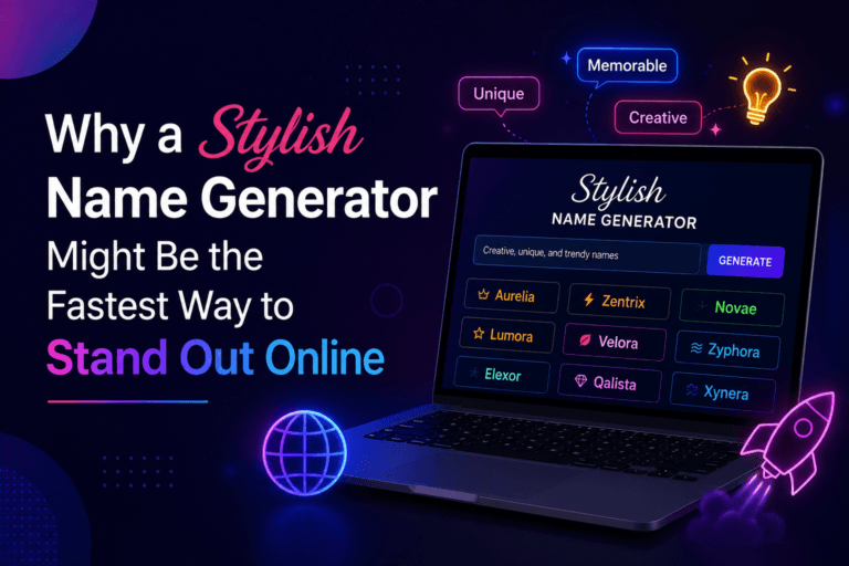
Somebody wanting a single word rendered large on a bright background has a solved problem.
Open a text generator, type the word, pick the colours, download. Ten seconds, no account, no cost, and the result is exactly what was expected because the template has one job and does it. Anybody reaching for a general image model to do that is making a simple task complicated.
The interesting question is what happens at the edge of that. When the words need to sit inside a scene rather than on a flat colour. When six graphics have to look like a set. When the brand has its own palette and the template offers nine presets, none of which match.
At that point a different tool is required, and GPT Image 2, with refined text control through Higgsfield is the one that made this category viable at all, because until recently no general image model could render a word correctly.
What do single purpose text generators get right?
More than people give them credit for, and it is worth being clear about that before arguing for anything else.
Speed. A template tool renders instantly because it is applying a known layout to supplied text. There is no generation, no waiting and no variance between attempts.
Predictability. The output is the same every time, which matters enormously if a series needs to be consistent. A generative model produces a different result on each run by design, and for a fixed repeated format that is a disadvantage rather than a feature.
Accuracy. The text appears exactly as typed, because it is being set rather than drawn, which is a different mechanism from how GPT Image 2 arrives at the same result.
And accessibility. No account, no cost, no learning curve, works on a phone. For the large number of people who need one graphic occasionally, that is the entire decision.
Those four things are why single purpose generators keep working despite general models existing. They are not a worse version of an image model. They are a different tool solving a narrower problem completely.
Where do people reach the edge of them?
At five fairly predictable points.
When the background needs to be a scene. A template offers flat colours or a small set of presets. A graphic where the words sit in a room, a landscape or a specific setting needs that setting to exist first.
When the palette is fixed by something else. A brand with defined colours will frequently find none of the presets match, and approximate is worse than nothing when a guideline exists.
When the output needs to be several related things. A launch needs a square, a vertical, a banner and a header, each composed for its shape rather than cropped from one image.
When the type has to interact with the image. Text behind an object, wrapping around something, or appearing on a surface within the scene. Templates place type on top, which is the correct behaviour for them.
And when the graphic is one element of something larger, such as an advertisement or a thumbnail where the words are part of a composition rather than the whole of it.
None of those are failures of the template. They are jobs it was never built for, and they are where GPT Image 2 starts being the better answer.
What changed about text inside generated images?
The rendering, and it changed recently enough that a lot of received wisdom is out of date.
Earlier image models treated text as texture. They had learned what writing looks like without any grasp of what letters are, so output resembled writing at a glance and dissolved on inspection. For a graphic where the word is the content, that was disqualifying.
GPT Image 2 renders text reliably, across multiple scripts, holding multi line layouts together with spacing and hierarchy intact. That single change is what moved general image models from irrelevant to relevant for this category.
There is a second difference worth knowing because it affects how to use it. GPT Image 2 resolves the layout before rendering rather than generating from pattern alone, which is why instructions about position, count and spatial relationship hold rather than being approximated. For anything where words need to occupy a specific part of the frame, that is the property being relied on.
What does GPT Image 2 do differently?
It produces the whole image rather than filling a slot in one.
The background is generated to the brief, so the words can sit in a scene that did not previously exist rather than on one of nine presets.
The composition responds to instruction. Stating that the text should occupy the lower third, or that the upper half should be left clear, produces that rather than something approximate.
Editing works on an existing image, so a graphic can be adjusted afterward rather than regenerated. Change the background, keep the type. Change the wording, keep everything else.
Any palette is available, described in the request rather than chosen from a list.
And any aspect ratio, composed for that shape rather than cropped into it.
The trade for all of that is variance, since GPT Image 2 produces a different result on each run. For a scene that is useful, because three attempts give you a choice. For a fixed repeated format it is the reason a template still wins.
Which jobs suit which tool?
A short division that covers most real situations.
Reach for a template generator when it is one word or a short phrase on a flat background, when you need it in under a minute, when the format repeats and must stay identical, and when the aesthetic is the point of the tool rather than incidental to it.
Reach for GPT Image 2 when the words need a scene behind them, when the palette is specified, when several formats are needed from one concept, when the type has to interact with the image, and when the graphic is part of something larger.
Use both on the same project more often than either alone. A campaign frequently needs a template graphic for the social post and a composed image for the header, and there is no reason those should come from the same tool.
The mistake worth avoiding in both directions is treating one as the upgrade. They are not on a ladder.
How do you write a request that renders text correctly?
Specifically, and with the wording isolated from the description.
State the exact text in quotation marks and keep it short. Accuracy holds better on fewer words, and a headline outperforms a paragraph.
Say where it sits. Upper third, centred, lower left. GPT Image 2 follows positional instruction reliably, and leaving it unstated means the model decides.
Describe the space around it. Requesting clear area behind the text produces a background built for legibility rather than one you then fight.
Name the contrast you want, light text on a dark scene or the reverse, since that determines whether it reads at thumbnail size.
Keep the styling description separate from the wording, so the model is not trying to interpret the words themselves as instructions.
And state the shape, because composing for a vertical and cropping to one produce noticeably different results.
What should be checked before publishing?
Every character, every time, and this is quick rather than onerous.
Read the GPT Image 2 output letter by letter rather than glancing at it. Familiar words are exactly the ones a reader’s eye completes without checking, which is how a wrong character survives into a published graphic.
Check it at the size it will actually appear. Type that reads comfortably at full resolution can close up at thumbnail, and most of these images are seen small.
Check any second language against a fluent speaker, since a rendering error in a script you cannot read is invisible to you and obvious to the audience.
And check that nothing unintended appeared elsewhere in the frame, which occasionally happens on signage, packaging or surfaces within a generated scene.
None of that is a reason to hesitate. It is thirty seconds of verification on something that took a minute to produce, which is a better ratio than most design work offers.
What about producing a set rather than one graphic?
This is where the comparison shifts most, and it is the case people underestimate.
One graphic is a fair fight. A template does it faster and a general model does it with more control, and either answer is defensible.
Six related graphics is a different problem. They need to share a look while differing in content and shape, which means holding a style constant across variations. A template holds it perfectly and cannot vary the content beyond the words. GPT Image 2 varies freely and needs the style pinned deliberately.
The way to pin it is to settle one GPT Image 2 image properly, then reuse what produced it rather than describing it again. The wording that generated an approved result is the valuable artifact, more than the image itself, and reproducing it from memory does not work.
That is also the point at which the workflow matters more than the model.
How does Higgsfield fit a workflow that uses both?
Higgsfield is an AI creative suite, meaning it carries several image and video models in one workspace rather than one model behind one prompt box.
Saved instructions are the main practical argument, given everything above. When a GPT Image 2 result is worth keeping, Higgsfield stores what produced it, which is how the sixth graphic in a set matches the first without anybody reconstructing a description.
Attempts stay side by side, which matters because generating three and choosing is normal practice rather than indecision. Comparing them is only realistic if they are visible together.
Reference images live with the project, so a brand asset or an approved previous graphic anchors what follows rather than being re-uploaded each session.
Editing happens in the same place, so adjusting an approved image is a step rather than a switch into another application.
And several models sit in one account, which for anybody comparing tools is the difference between running a real test and reading somebody else’s. Running identical wording through GPT Image 2 and an alternative takes ten minutes and answers the question for your own material.
It runs in a browser, which for people already using free web tools is the relevant baseline.
How would a first comparison go?
Twenty minutes, using something you actually need.
Take a graphic you would normally make in a template tool and make it there first, so you have a baseline.
Then make the same thing with GPT Image 2, stating the exact wording, the position, the clear space and the shape.
Compare them honestly. For a simple flat graphic the template may well beat GPT Image 2, and knowing that is useful rather than disappointing.
Then change the brief. Put the same words in a scene, or produce three shapes from one concept, and compare again. This second test is where the difference appears.
Save whatever produced the result you preferred, because that wording is what makes the next one quick.
Conclusion
A text generator renders one word on a bright background faster and more reliably than anything general will, and that is most of what most people need.
The edge arrives when the words need a scene behind them, a palette somebody else specified, or five shapes that look like one campaign. GPT Image 2 handles those because it renders text properly and resolves layout before drawing, and Higgsfield keeps the wording that worked so a set stays a set.
Use the template when the template is right. It usually is.