Zalgo Text Generator: How Cursed Text Really Works
That strange broken text that looks like it came out of an internet joke is not a font or an image or something added later. A zalgo text generator creates it one letter at a time using Unicode characters that are placed in ways they were never supposed to be. This guide explains how zalgo text really works, where the name really comes from compares the free tools for creating it and talks about the real serious dangers that most generator sites never tell you about.
What Zalgo Text Actually Is
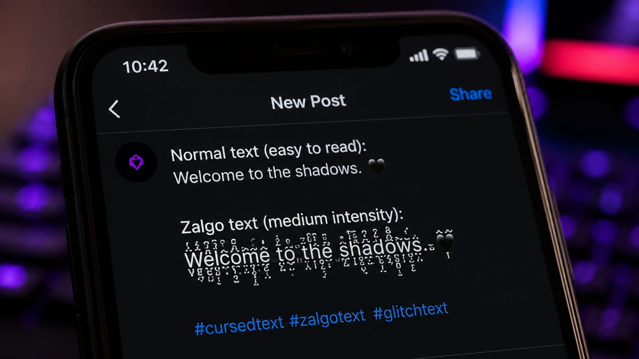
Zalgo text, also called glitch text or cursed text, is ordinary text with dozens or hundreds of extra Unicode marks piled on top of, through and beneath each letter until the words appear to drip, spike and overflow their line. Despite how broken it looks, the base letters underneath are completely normal and fully readable once the extra marks are stripped away.
The effect of zalgo text is similar, to bold, cursive and strikethrough text. It uses Unicode characters, not an image or a special font. What makes zalgo text different is the scale. It adds a lot of characters to each letter not just one. This is what makes zalgo text go from an accent mark to something that is really visually crazy. The zalgo text effect relies on stacking characters, which is what creates the chaos.
The Real History Behind the Name
The name traces back to 2004, when a member of the Something Awful forums posted a set of image macros showing a Nancy and Archie comic strip visually corrupted, with the characters appearing to be overtaken by something dark and unexplained. That weird and creepy style of corruption got linked to the word Zalgo. The meme started to spread from there. Now it is a part of what fans call meme culture. Zalgo is still a part of this culture. People who like this kind of thing really enjoy the weirdness of Zalgo and surreal meme culture.
Over the following years, the character of Zalgo grew into an internet mythology of its own, an ominous, unseen entity said to corrupt minds and drive people to madness, reinforced by phrases like He comes and references to a Nezperdian hive-mind that appeared in an Urban Dictionary entry in 2009. None of this mythology is required to use zalgo text today but it explains why the style still carries a distinctly ominous, horror-adjacent reputation more than two decades later.
How a Zalgo Text Generator Works
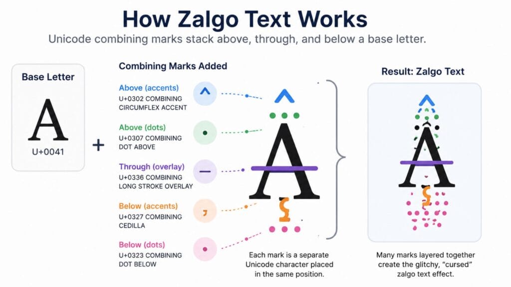
Zalgo text relies on combining diacritical marks, the same category of Unicode character responsible for everyday accents like the acute mark on cliché or the tilde on jalapeño. The Unicode Consortium’s own chart documents dozens of these marks, each designed to attach above, below or through a base letter one at a time. A zalgo generator simply attaches many of them to the same letter at once rather than the single mark a normal accented word would use.
Because every extra mark goes on top of the one instead of taking its place the look is completely adjustable. A generator with a low intensity setting adds a few marks per letter for a soft slightly strange appearance while a high intensity setting can add many marks, per character creating a tall hard to read group of marks that is known for the most extreme zalgo text.
Zalgo Text vs Strikethrough: Same Trick, Bigger Scale
If you have read our strikethrough text generator guide, you already understand the core mechanism behind zalgo text, since both rely on the exact same category of Unicode combining character. Strikethrough text attaches a single combining mark, typically U+0336, after each letter to draw one line through it.
Zalgo text takes that identical technique and removes the limit, attaching many different combining marks to the same letter simultaneously rather than just one. The underlying Unicode mechanism is identical in both cases. The only real difference is restraint: one mark per letter reads as a clean strikethrough, while dozens of marks per letter reads as chaos.
How We Picked These Tools
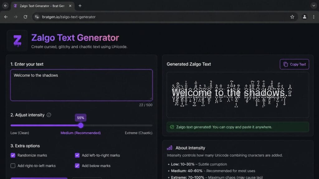
This list favors generators that let you control intensity rather than only producing one fixed, maximum-chaos output, since a tool with no adjustment forces you into the most extreme version of the effect even when a subtler one would work better. Each entry was judged on how granular its intensity control is, whether it lets you choose which direction marks stack (above, below or through the letter) and how clearly it warns about performance and rendering issues at high settings.
Quick Comparison Table
| Intensity Level | Marks Per Letter (Roughly) | Visual Effect | Best For |
| Light | 1 to 5 | Subtly eerie, still fully readable | Bios, captions, everyday posts |
| Medium | 5 to 20 | Clearly glitched, readable with effort | Halloween posts, horror captions |
| Heavy | 20 to 50 | Dense, dripping, hard to read | Short shock-value posts, memes |
| Maximum | 50 plus | Wall of marks, barely resembles original text | Pranks, novelty use only |
Best Zalgo Text Generators to Try
A generator with a visible intensity slider and a live preview is the easiest way to find the exact level of chaos that fits your post, since eyeballing the result in real time beats guessing and regenerating repeatedly. Favor a tool that also lets you toggle mark direction separately, since marks placed only above and below a letter tend to render more reliably than marks placed directly through the middle of a character.
If you specifically want the widest range of related cursed and glitch effects rather than zalgo alone, a combined text-styling suite that also offers strikethrough, mirror and other Unicode effects in the same interface saves time compared to switching between several single-purpose tools.
Choosing the Right Intensity
Light intensity works best anywhere you still want the underlying words to be read easily, a slightly unsettling bio line or a subtle horror-themed caption where legibility still matters. Medium intensity is the sweet spot for most Halloween posts and creepypasta-adjacent content, since it clearly signals the cursed aesthetic without becoming a genuine effort to decode.
When you want to get a point across you should use strong language only for a little while. This is good for one word or a surprise that jumps out at you. It is not good, for trying to tell someone something. The words you use the more it looks cool but it is hard to read. So you should use language only when you really want people to understand what the words are saying.
Where Zalgo Text Works Best
Zalgo text earns its place in horror-themed captions, Halloween posts, creepypasta writing and playful pranks, exactly the corners of the internet where it originated and where its ominous reputation still fits naturally. A well-placed zalgo word in an otherwise normal caption creates a strong visual contrast that plain text or even other fancy text styles cannot match.
It works less well anywhere clarity matters, professional communication, important instructions or long passages a reader actually needs to absorb, since even light intensity adds visual noise that slows reading and heavier settings can make text functionally unreadable.
Real Risks: Crashes, Accessibility and Character Limits
Extremely dense zalgo text is not just visually chaotic, it has a documented history of actually causing real technical problems. Because each stacked mark is a separate character the device has to render, sending an extremely high-density zalgo message can noticeably slow down or in rare cases on older or lower-powered devices, crash the app or browser trying to display it. Some platforms and chat clients have specifically added limits on combining marks for exactly this reason.
Character counts also inflate dramatically, since a five-letter word at heavy intensity can easily use hundreds of actual Unicode characters once every combining mark is counted, which matters on platforms with strict length limits. Screen readers fare especially poorly with zalgo text, often announcing each individual combining mark by name rather than reading the underlying word at all, which makes dense zalgo text genuinely inaccessible rather than just stylistically unusual. Keep these risks in mind before sending anything beyond light or medium intensity to someone else and avoid maximum intensity entirely in shared or public spaces where you cannot predict what device will render it.
How to Copy and Paste Zalgo Text Anywhere
1. Open a zalgo text generator and type or paste the word or phrase you want to corrupt.
2. Set the intensity to the lowest level that still achieves the look you want, since restraint reads as more deliberate than maximum chaos.
3. If the tool offers direction control, consider limiting marks to above and below the letter rather than through the middle for more reliable rendering.
4. Click the copy button next to the result or manually select and copy the text if no copy button is available.
5. Paste the text into your bio, caption or message using Ctrl+V on desktop or a long press and Paste on mobile and preview it before sending anything at heavy or maximum intensity to another person.
Exploring the Rest of the Text-Styling Family
Zalgo text is one of the more extreme members of a much larger family of copy-paste Unicode styling covered across this site. Our fancy text generator guide organizes every major style, bold, script, small caps, mirror and more, into one comparison and the strikethrough text generator guide covers the same combining-mark technique in its simplest, single-mark form.
Visit Bratgen.io for a broader collection of free text and font generator tools beyond cursed and glitch text, it is worth exploring what else is available on the same site rather than switching between separate tools for each style.
FAQs
Is zalgo text dangerous to send someone?
Zalgo text itself is safe in that it cannot install anything or hack a device but extremely dense zalgo text can genuinely slow down or in rare cases, crash an app or browser trying to render it, particularly on older or lower-powered devices. Sticking to light or medium intensity avoids this risk almost entirely.
Why does zalgo text look different on different devices?
Different apps and fonts handle stacked combining marks slightly differently, so extremely dense zalgo text can render inconsistently, overlapping neighboring lines on one device while displaying more cleanly on another. This is a known limitation of stacking many marks at once rather than a flaw in any specific generator.
Where does the name zalgo actually come from?
The name comes from a 2004 internet meme that began on the Something Awful forums, where a corrupted-looking version of a Nancy and Archie comic strip was linked to an unseen, ominous entity that fans named Zalgo. The visually corrupted, dripping style of that original meme became the basis for the text effect known by the same name today.
What is the difference between zalgo text and strikethrough text?
Both use the same category of Unicode combining character but strikethrough attaches a single mark to draw one line through each letter, while zalgo text stacks many different marks on the same letter at once. The mechanism is identical, only the intensity differs.
Is zalgo text accessible for people using screen readers?
No it is not reliable. Screen readers often say each mark by its official name instead of reading the word that is underneath. This makes it really hard or even impossible to understand text with a lot of marks like zalgo text, when you are using special tools to help you. You should only use this kind of text for things that’re not important, like decorations and not, for anything that you really need to know.
Can I control how intense my zalgo text looks?
Most modern zalgo text generators have a control that lets you decide how many extra marks to add to each letter. You can make it look really subtle or really crazy with a lot of marks. It is better to start with an amount of marks and add more only when you need to. This way the zalgo text is easier to read and looks like you did it on purpose.
Conclusion
A zalgo text generator uses the same combining marks that are used for regular accents and puts them way more than they should be making simple words look like they are dripping and glitching out. This look has been part of internet horror culture since 2004. Light and medium levels work well for uses while heavy and maximum levels can cause real problems like apps crashing and text that is hard to read. These risks should be respected of ignored just for the sake of making things as chaotic as possible.
If this explanation helped you understand what is really going on with the text share it with someone who is still trying to figure out why their screen slows down every time a friend sends a big block of zalgo text. Leave a comment with the intensity level that you think works the best.